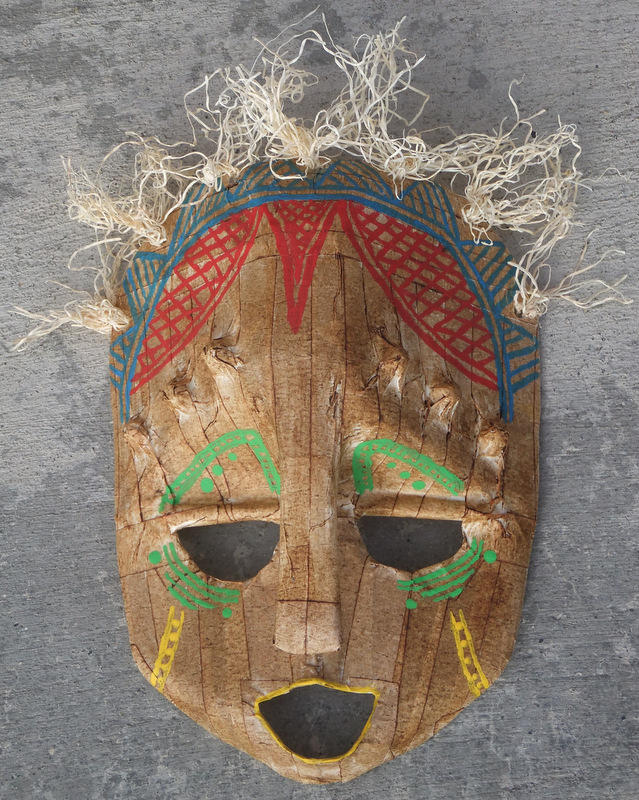
This Milk Jug Mask was hands down my absolute favorite project of the entire semester. I had so much fun designing the mask to include implied and literal texture. To begin, I washed out a milk jug, drew the desired shape of the head and then cut out the mask shape and dried the jug with a towel. When it was dry, I cut out the eyes, mouth, and cut the handle of the jug into a nose. Next, I rolled up foil to create the balls on the forehead and the lines above the eyes and taped them down with masking tape. When those were in place, I taped the entire mask with masking tape, attempting to create a symmetrical design with the lines. Next, I rubbed brown show polish all over the tape to create the wood-type feel of the mask. Then it was time to paint! I used a very small brush and painted the lattice work on the forehead and then created simpler symmetrical designs around the eyes, cheeks and mouth. Finally I hole-punched holes at the top and tied curly raffia around the holes for the hair. This project was all about creativity and design which allowed me to have a lot of fun. These types of projects that really showcase personality are right up my alley and everything turned out exactly how I expected it to. Although I was hesitant at first, this project was just way too fun to pass up and I can't think of a single thing I would do differently with my mask!
I created this paper plate African mask using a paper plate, brown and cream colored paint, a hole punch, feathers and newspaper. I wanted to make a mask using a simple technique that could be used by younger grade level teachers as a fun way to teach about the culture and design behind African masks. I started this project by first cutting out the eye holes, then I rolled up newspaper and glued it on the plate to make the raised nose and mouth. Next, I used the hole punch around the top of the mask to later fill in with feathers. After that, I painted the entire mask brown and once it was dry I painted on my symmetrical design with cream colored paint. I drew the dots with the opposite end of my paint brush. When the design was as I wanted, I finished the mask by putting the brightly colored feathers through the holes and taping them to the back. This project was fairly simple, turned out exactly as I wanted it to and it was lot of fun to learn about the African culture as I went.
To create my zentangled design, I first had to make the scratch board. To do this, I started by filling an entire page of watercolor paper with pastels. This part was a ton of fun but it did end up hurting my fingers during the rubbing process to make the pastels more smooth. Once that was done, I mixed black tempera paint with dish soap and painted it over my pastels. I attempted to apply this on thick, but no matter what my ratio of paint to soap was, I could not get that mixture to paint on thick to save my life! Due to this, I ended up having to do 5+ coats just to cover the pastels. This ended up being a huge mistake because when it came time to scratch off the paint to reveal the colors underneath, it was extremely hard and I ended up scratching off a lot of the pastel colors as well because I was scratching so hard and deep. I ended up doing this project at least four times in an attempt to get a better scratch board that wasn't so thick but I had no such luck. The above project is the best of the bunch and I still wish the colors were more vibrant and the black was darker. If I were to do this again I would talk to other students in the class to see what they did to get theirs to work so then I could go home and try again using their process.
Hands down this was my absolute least favorite project of the entire semester because the technique didn't work out like it was supposed to so I had to improvise which ended up taking an extremely long time to complete. For this project we were supposed to use washable glue and non-washable tempera paint on cotton fabric to create the design. However, when I tried this technique the glue soaked into the fabric, spreading out into massive lumps and then when I tried to paint it, the glue still soaked in the paint and therefore it didn't wash out properly. At this point I had to figure out a different way to create the design. So I instead tried using hot glue and what a mistake that was! The glue didn't spread or soak in the paint, but when it came time to take the glue off, it weirdly stuck to the fabric because the paint had acted as some kind of adhesive. This meant that I spent over an hour peeling off the glue in an attempt to get a finished piece, but some of the paint speared during the process. However, I was fortunate in the sense that when all was said and done the fabric took on this grungy, hippie look that ended up looking really awesome! Still, if I had to do this project over again, I just wouldn't.
The 100-Color Challenge tested the paint mixing abilities of my un-artistic husband and I. Together we had to create 100 different colors, 50 of those using water-colors and the other 50 using tempera paint. When we started on this project I thought it would only take us about twenty minutes to figure out all the colors, but in the end it took us over an hour because we had to think of ways to mix only the primary colors and black and white to create all these colors. We started out with watercolors which actually ended up being the harder paints to mix into 50 colors because the colors changed when they dried, making it almost impossible to tell if some of the colors were different or not until after the colors had dried, slowing down the process immensely. The tempera paint was a lot easier and more fun to use and we ended up with a lot of different and fun colors that I would have never known about beforehand. If I were to do this differently I would make sure that before we started my husband knew that he could mix black and white to the primary colors because I found out half way through the watercolors that he hadn't realized that and that is why he was taking much longer than me to figure out a new color to paint!
This alien name project was without a doubt one of my favorites from the semester because during this project I got to think like a little kid would in order to create a beautiful alien from a different planet. To start the project, I took a square piece of paper, folded it in half, drew my name in bubble letters and then cut along the outer lines. When I opened up my name it created this crazy-fun alien body design. When I saw the shapes of my letters together I immediately thought of an octopus type creature so right then I knew that my alien had to live on an underwater planet. To achieve this look, I gave my alien four tentacles, a connected, sweeping leg to move around on and a huge mouth for eating other underwater creatures. However, I didn't want my alien to be just any normal octopus-like alien so I covered his entire body with cut up pom-pom balls to create the look of fur and used felt to embellish his mouth, eyes and suction cups. I had so much fun designing this alien and his habitat that it didn't feel like homework at all! Instead, I was just an elementary kid myself re-living the wonderful glory days.
kidprintsFor this first printmaking project I was inspired by my kids and their way of life so I wanted to involve them in the painting as much as possible.To start out we first mixed paint with bubbles and then we each took turns blowing different colored paint bubbles at the paper. My kids were ecstatic to see the different sizes of bubbles we could create by blowing softly or quickly. Next, I painted one hand and foot of each of my children and had them place their hand or foot on the paper to create a print. The prints turned out very well from my daughter because she is older and she was able to sit still longer. On the other hand, my son's prints turned out very smeared because he did not like sitting still long enough to get a full print. We did these prints a few different times and even though they didn't turn out exactly like I wanted them to, I think they are perfect because I was able to create them with my children. Plastic bag printsI created this plastic bag print by first painting an abstract design on a plastic bag which I would then place on the paper and rub to get the paint off. I then created ghost prints by doing it a second time without replacing the paint on the bag. On some of the background prints, I took a Q-tip and drew lines or squiggles to create texture for the background. Next, I painted flowers or random circles on the bag and embellished them with Q-tip designs which I then printed over the background to make the flowers stand out. This process was easy and a lot of fun. I ended up doing multiple pictures using this print-making method but this one is my favorite because of the dark, rich colors which play so nicely off of one another.
This light painting is particularly special to me because the requirement for the project was to tell a story through the painting and during this time I had just found out that I was pregnant so I wanted my painting to portray that. To create this light painting, I had my camera set up on a slow shutter speed, then I drew the 'baby' using a circular glow stick and my husband was behind me outlining my torso with a flashlight. Even though this light painting may seem simple, this actually took a very long time to figure out. We created this through a lot of trial and error because we first had to figure out how fast to 'draw' with the light and then we had to see what light sources showed up best on camera and then we had to time our movements perfectly together to not get extra lights painting in an unwanted area. At first I had expected to do a much more elaborate painting but was limited due to the camera's settings and the amount of people I had around to help me. Therefore, if I were to do this project over again I think I would gather up a lot more people and find a nicer camera that would fit my needs better in order to create a larger and more detailed painting.
This project is entitled Cardboard Gears because the entire thing is made out of cardboard and spray paint and when I finished with the design I looked at it and immediately saw gears on a machine (even though that was not my intention). I had a lot of fun experimenting with this design but I did find it was very time-consuming. Most of the 'gears' are made out of toilet paper rolls which I cut small slits into and then unwound the tube and twisted the parts to create the different types of spirals. The elongated and thick spirals as well as the circles were made out of normal cardboard which I found out was extremely hard to cut and shape. The backdrop for the spirals was also cut from normal cardboard and then I glued the two matching pieces together to create the backdrop. This took the most time and by the time I was done, my hand was sore from all the cutting. If I were to re-do this I would definitely find a box cutter to make the process faster and less painful. Altogether it was a fun project and it really stretched my artistic ability as I honestly hate abstract. However, I do think this project turned out rather well so I may have to start delving deeper into abstract art.
These six images are painted using different watercolor techniques to portray six different emotions. For the top left I did the emotion of happiness using a brush with very little water to get the deep, vibrant colors and then I flicked the brush with my fingers to get the red paint splatters. The top middle portrays love and for this I used a white crayon to create the upward moving lines as well as a very wet square and brush to create the soft colors. The top right square is anger. For this emotion I used a mixture of wet and dry brushes to get the light vs. dark feel of the colors. I then sprinkled salt on top of the wet colors and splattered black on top of the salt to get the spread out, dark feeling. The bottom left square is jealousy and the technique I used was to paint the square green and then I placed a piece of saran wrap on top and allowed it to dry. The bottom middle is the feeling of depression. For this one I used the white crayon to create the boxed in stripes, then I painted with a dark grey and placed foil over the color to dry. When it was mostly dry, I removed the foil and used a straw on the wet parts to create the circle features. Finally, the bottom right portrays sadness. For this, I wet the entire square down and then dripped blue over the water and turned the paper until the drips filled the square. I had a lot of fun with this project and learned a lot about different techniques to create fun textures with water colors.
|
ArchivesCategories |